Being asked to summarize months or even years of work is tough. Thankfully, you can use your study’s conclusions to help generate an abstract of 200-odd words. Then there’s the elevator pitch, ideal for conferences and interviews, which might last anywhere between about 30 and 90 seconds. But what about further down-scaling? Attention spans are growing shorter: could you pitch your work to someone in just 2-3 seconds?
Yes, you can!
Let me put it this way: if a picture is worth a thousand words, then your abstract image (or table of contents image) has the potential to communicate more than your elevator pitch, and in a shorter time.
Visualizing Your Paper
A common misconception is that the abstract image should capture the details or key results of a study; rather, it should capture an audience. Communicating and interpreting the results of your work is the job description of the paper itself. The abstract image should be the eye-catching advertisement that stops someone from scrolling away and invites them to ask questions, to look at your paper and to learn more.
Abstract images should therefore not provide too much information. They should tease the reader with an idea, give them a clue as to what the study is about, and do it in a visually attractive way. They don’t have to be master artworks, but they should be more than just a copy of your paper’s figures, hashed creatively together.

Keep it Simple, Minimize Text
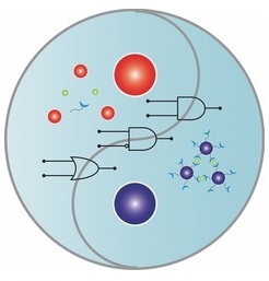
That’s not to say that the image shouldn’t include any information at all: it should clearly relate in some way to the work that the paper describes. But too much text or a lot of small details make an image look ‘busy’, and this requires more time and attention to untangle – even for someone who is already interested. Your reader might be someone on their way to work, their phone in one hand, skimming a list of recent papers linked in an alert email. You’ve got mere seconds to grab their attention – so you don’t want to make them work too hard.
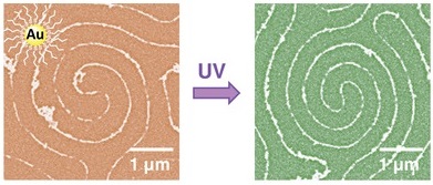
You also don’t want the image to answer all the reader’s questions, and thereby completely satisfy their curiosity about your paper. Ideally, the image should immediately raise questions about the work done, hooking your audience and encouraging them to follow the link to find out more.
Make it Colorful
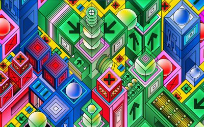
A good black and white image can be powerful, but professional online publication platforms tend to have white backgrounds, which means that a little bit of color stands out nicely. The use of contrasting colors can help to focus the attention of the viewer on a particular detail. Two or three colors work better than applying a whole rainbow, as adding more colors can be like adding too many details, leading to visual confusion (see point 7 here).

Reality Check
Once you’ve put together a few ideas, take a step back. If it were you on the bus with your phone in one hand, scrolling down a page of abstracts, would you stop to look at your own image? Would it stand out and be easy to understand? Ask your friends and colleagues to take a look – after all, they’re your peers, the very readership you are trying to attract. And of course, when your paper is accepted and you’re making the final minor changes for publication, ask your editor! We’re here to help.

