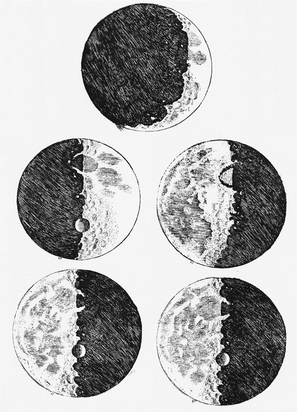
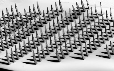
 Although they’re a key part of almost any writing on scientific research, the preparation of scientific figures is a skill that is often taught only briefly, or ever perhaps not at all, to researchers at the beginning of their careers. If you consider that having good figures increases the chances that your work will be better understood, more easily digested, and therefore more frequently cited (and this is all after they’ve improved the chance that it will be accepted!), then the lack of image-making skills in the scientific community is cause for concern.
One group of academics who would agree with this are Professors Marco Rolandi, Karen Cheng, and Sarah Pérez-Kriz – one materials scientist, one graphic designer, and one cognitive psychologist – who have come together to publish, for the first time in over half a century, a guide to preparing figures for a scientific paper.
Following on from the famous 2004 essay by George Whitesides on how to prepare the paper itself, their brief guide covers the role and importance of figures in science, how to design for an audience, and how to focus on and present the most important information you want to convey. It’s also available for free for the next few months, so I’d recommend checking it out, whether you’re preparing to write your next (or even first!) paper or not – the skills they discuss transfer right across visual design and presentation.

